In 2026, color becomes a silent force shaping emotion, material choice, and design intention. Rather than loud statements or fleeting trends, the leading hues of the year reflect a collective desire for clarity, balance, and conscious creation. For the jewelry and watch industry—where value lies in longevity, precision, and meaning—these colors offer a renewed vocabulary. They invite designers to rethink gemstones, metals, and surfaces as carriers of atmosphere and philosophy, not just ornament. Let’s explore the new chromatic language for the jewelry and watch industry in 2026.
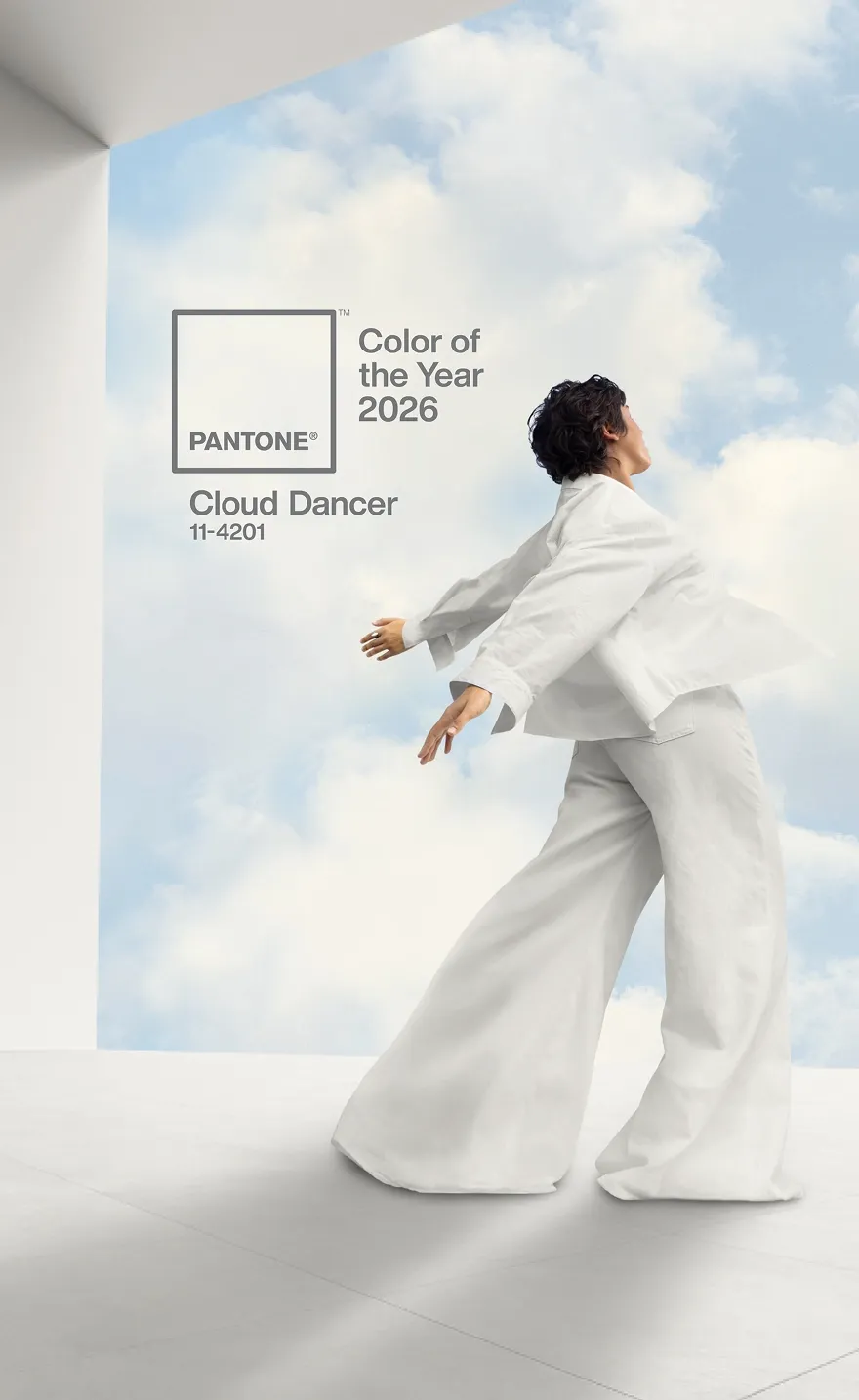
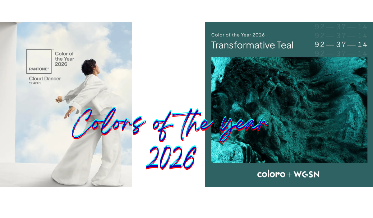
This chromatic language begins with a return to visual calm, embodied by Cloud Dancer, the Color of the Year 2026 selected by the Pantone Color Institute. As a global authority in color forecasting, Pantone identified this balanced, airy white as a response to a world increasingly saturated with noise and overstimulation. Described as “a billowy, balanced white imbued with a feeling of serenity,” Cloud Dancer reflects a cultural need for quiet reflection and mental space. Leatrice Eiseman, Executive Director of the Pantone Color Institute, explains that the shade serves as “a calming influence in a society rediscovering the value of measured consideration and quiet reflection.”
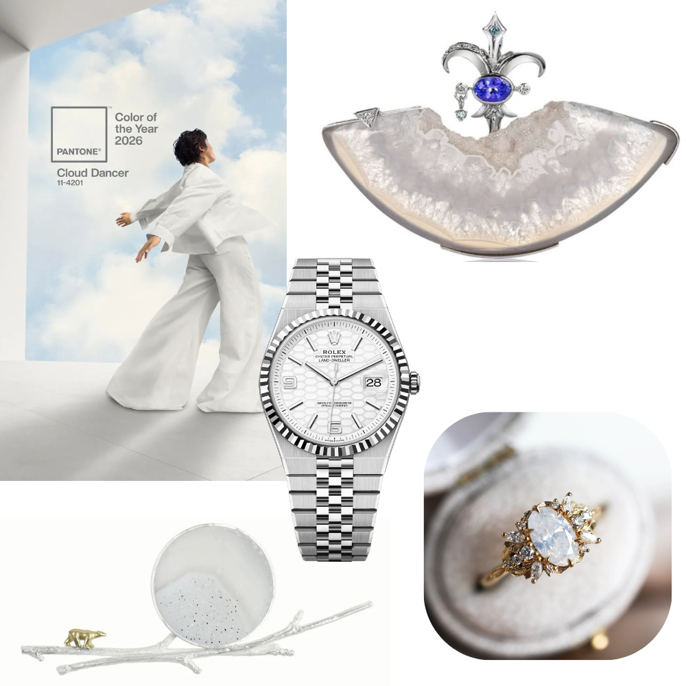
In jewelry, Cloud Dancer shifts attention away from excess and toward purity of execution. White diamonds, moonstones, and white sapphires regain prominence when their luminosity is softened rather than intensified, favoring diffused cuts, satin finishes, and subtle light play. Rock crystal and white opal enhance this aesthetic through transparency and organic depth, allowing light to move gently through the piece. When paired with platinum, palladium, or white gold, these materials create jewelry that feels timeless, architectural, and emotionally soothing. In watchmaking, Cloud Dancer inspires pale or matte dials, minimal typography, and open constructions where space and light become essential design elements, highlighting mechanical precision through restraint rather than complexity.
![]()
Complementing this quiet neutrality, Transformative Teal emerges as the Colour of the Year 2026 selected by WGSN in collaboration with Coloro. Known for its data-driven approach to trend forecasting and consumer behavior, WGSN identifies 2026 as a year of redirection shaped by ecological urgency and a desire for meaningful change. Transformative Teal, a fluid fusion of dependable blue and aquatic green, reflects both stability and motion. Clare Smith, Senior Colour Strategist at WGSN, describes the shade as one that “encourages resilience in the face of complexity,” aligning color with emotional restoration and environmental awareness.
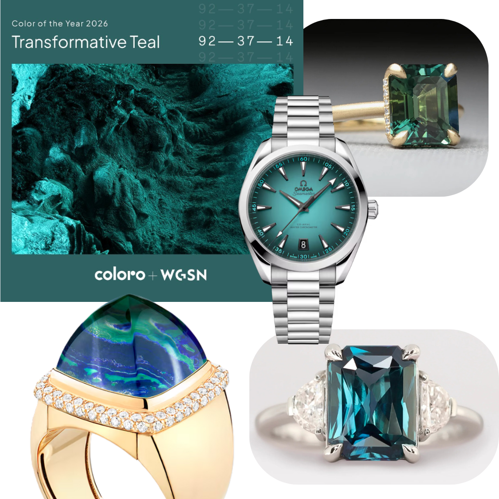
In jewelry design, this hue unlocks creative potential through gemstones that naturally express depth and chromatic movement. Teal sapphires, Paraíba tourmalines, and blue-green zircons reveal layered tones that evolve with light, lending themselves to sculptural settings and contemporary silhouettes. Chrysocolla and apatite further anchor this palette in the natural world, reinforcing narratives of sustainability and responsible sourcing. In watchmaking, Transformative Teal appears in lacquered or gradient dials, aquatic textures, and brushed finishes that evoke water, movement, and durability. Paired with recycled gold, titanium, or darkened metals, the color bridges heritage craftsmanship with future-oriented design.
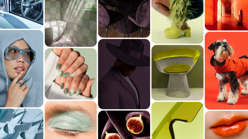
Beyond institutional forecasting, visual culture and consumer behavior also shape the color landscape of 2026. Pinterest’s Pinterest Palette 2026, built on billions of searches and saves, highlights how people increasingly use color to express mood, identity, and intention. Rather than centering on a single dominant shade, the palette reflects a spectrum of emotional states that resonate deeply with contemporary audiences. Cool Blue responds to a collective desire for clarity, focus, and visual reset, translating in jewelry and watches into crisp gemstones, frosted finishes, and high-legibility designs. Jade introduces a grounded, mineral elegance that reconnects luxury with nature, lending itself to refined green stones and tactile surfaces. Deeper tones such as Plum Noir reflect a growing appetite for expressive depth and storytelling, ideal for statement gemstones and dramatic dial treatments. Wasabi brings an unexpected surge of energy and creative boldness, encouraging experimental accents and contemporary contrasts, while Persimmon adds warmth and vibrancy, echoing a desire for joy, optimism, and emotional connection. Together, these hues position color as a tool for emotional resonance, offering the jewelry and watch industry a data-driven yet intuitive framework for translating cultural shifts into material form.
Balancing these expressive tones, earthy and utility-inspired neutrals continue to gain relevance, reinforcing a desire for functionality and authenticity. In jewelry and watch design, this translates into the use of smoky quartz, brown diamonds, tiger’s eye, and green tourmaline, paired with brushed metals, leather straps, and matte surfaces. These combinations emphasize durability, wearability, and tactility, aligning luxury with everyday life and long-term value rather than seasonal excess.
The Colors of 2026 reveal a profound evolution in how color is understood within the jewelry and watch industry. Selected by institutions such as the Pantone Color Institute, WGSN × Coloro, and shaped by platforms like Pinterest, these hues reflect deeper cultural shifts toward calm, responsibility, and intentional creation. Cloud Dancer elevates silence and purity, Transformative Teal embodies change and renewal, the expressive spectrum of Pinterest’s palette channels emotion and identity, while grounded neutrals anchor luxury in function and authenticity. Together, they form a chromatic language that encourages designers to create pieces that resonate emotionally, endure materially, and speak quietly—but powerfully—through time.